Planning the Titles - The Typography Behind Eye-Catching Titles
Hi everyone! Welcome back to the 2nd part of planning my movie opening. This blog will focus specifically on title design. Now, my title research has properly prepared me for this part of planning so without a further-ado I’ll start explaining my thoughts.
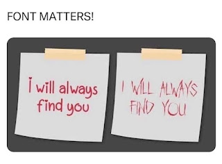
The first thing to determine was what size font I want the titles to be. Since I want viewers to focus on the visuals more than the lettering I’m choosing to choose a title that camouflages into the background slightly more but doesn’t necessarily blend in completely. In order to be less-striking on the eye I want to use a consistent font. To find this font I sifted through the app “iFont” which has hundreds of fonts to choose from. I actually looked at the website dafont.com linked to iFont for more fonts. I am looking for a clean-cut, easy-to-read, and quite honestly lamen font. When I went into the font quest I was looking for something that would replicate “Times New Roman” and “Spectral” fonts. Typically I gravitate towards fonts like “Alata”, “Lexend”, and “Fredoka One” which have softer edges and a warm, bubbly, accepting vibe. It was very hard to refrain from these types of fonts and choose something more rigid and factual but eventually I landed on choosing between “Spectral”, “Camera Obscura DEMO”, and “Milk And Honey Regular”. In order to narrow down the options I had to assess the “pros” and “cons” of each font. This started with “Camera Obscura DEMO” which got vetoed since the font was super chunky and drawed too much attention to the eye. I was thinking about using “Milk And Honey Regular” for a while but the mixture of fonts could look tacky so I decided to disregard it. That left me with the tried and true “Spectral” as my primary font. Of course to offer some variation I plan on playing around with using all capitals and boldface lettering. Though, when I started planning my working title this font wasn’t available but in that very moment I found a font that had the same features named “ American Typewriter” which I have chosen to use in the title for now. As the editing process continues I may change between the different variations of “Spectral” and “American Typewriter” but I plan on always referring back to either. Notably, for the crime scene reports the font “Rough Serif Regular” replicates a “stamped” affect really well which i have seen in many crime-related evidence. Therefore it would only be appropriate to include this font sporadically.
Moving on, the color of the font is just as important. In order to remain factual I want to use white for titles. The color white is usually linked with purity so being pure can be translated to being truthful. In a documentary where facts are being recollected, maintaining validity is very important so if I can use connotations of colors with that the validity is less likely to be questioned than if I used vibrant neon colors.
In regards to sizing, I would like the title of the role to be in a slightly smaller font and the name of the person slightly larger to put a vocal point on the person themselves. I saw this same pattern of sizing almost universally in the opening sequences I studied.
Each title will enter the screen by rapidly fading in and out of the screen almost in a “flash” like montage. The reason being it will look less choppy then just cutting in and out. Though, they will stay on the screen for around 5 - 10 seconds to ensure the audience can see the title long enough to read it. This time frame may be extended or shortened based on how the editing process goes but all the titles will be on the screen for the same amount of time.
Finally, the moment you’ve all been waiting for is revealing my working title.
As you can see I have emulated the title from Curry & Cyanide: The Jolly Joseph Case (2023) in totality. Since this is a fully fake story I made up a name, Elena Mercer, to fit into the story. There is no reason behind this name, I simply just randomized it. The part “fatal flaw” is interesting and catchy due to the alliteration in the title. It also aligns with my pitch since it's about a perfectionist who makes a grave mistake (aka murders someone). On the slide that shows the title in the opening sequence I wrote “A true crime Documentary” this touch is something I saw a lot in in the genre. For some reason the title designer likes to reiterate this is a true story so I did the same in my title. Note that I used a stock image of a crime-related collage in the background, I plan to replicate this with evidence (aka props) from the crime ill be “investigating”.
Wow! I never realized how interesting typography was till now. It was actually very interesting to explore the whirlpool I went down. I hope my little knowledge of typography translates well into my working title design!


Comments
Post a Comment